2019-8-6 14:40 |
Despite all the flak it caught for its revamped look, I tried giving Twitter‘s new design a fair shake. The updated layout is supposedly faster, more intuitive, and easier to customize – and for the most part, it is.
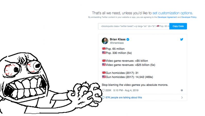
But as much as I wanted to dig the redesign, there’s one aspect that truly ruffles my feathers: the new tweet embed UI. It’s unnecessarily complicated, significantly less convenient to use, and, quite frankly, the antithesis of intuitive. For those unfamiliar with the embed UI, the feature is particularly useful if you want to include Twitter replies in a blog post,…
This story continues at The Next Web
Or just read more coverage about: Twitter
. origin »
Bitcoin price in Telegram @btc_price_every_hour
Time New Bank (TNB) на Currencies.ru
|
|


