2021-10-29 15:44 |
Today’s on-chain analysis by BeInCrypto looks at the behavior of long-term Bitcoin (BTC) hodlers to determine the current stage of the cryptocurrency market. The total supply of long-term hodlers (LTH) peaked in mid-October and, along with the new all-time high (ATH) for BTC, the first signs of distribution of their coins are visible.
In addition, two more indicators signal behaviour typical of the early stages of the final phase of a bull market. The supply shock ratio for LTH is just at the all-time low (ATL). Meanwhile, Realized Cap HODL Waves indicate that the young coins are slowly starting to increase their activity.
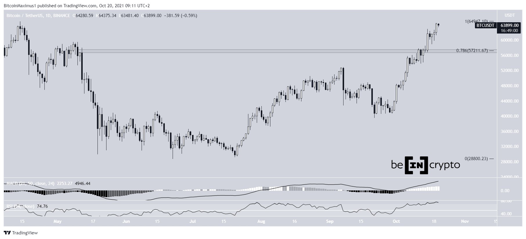
BTC price actionIn the last two weeks, Bitcoin has returned to the top of the range from the historical ATH of April 2020 (yellow line). Moreover, BTC set the new ATH at $67,000 on 20 October. It then fell to a low of $56,425 on October 28.
BTC chart by TradingviewThe rise to a new peak has continued uninterrupted from the low near $40,000 at the end of September 2021. The short-term correction and consolidation after the bullish signal in the form of a new ATH is a healthy price action. It sets the stage for further price movement.
Inverse correlation between LTH and STHA recent Glassnode article pointed out the historical correlation between the supply of Bitcoin held by long-term holders (LTH) and short-term holders (STH). Both charts behave almost like mirror images – when LTH holdings increase, STH holdings decrease, and vice versa. This inversely proportional behaviour can be seen, especially around the peaks of Bitcoin cycles. This is when the LTH supply drops sharply and the STH supply rises sharply.
Correlation between LTH and STH supply / Source: insights.glassnode.comFurthermore, the chart shows that the long-term supply of BTC in the hands of LTH is a monotonically rising curve with strong deviations near price peaks. In contrast, the chart of the supply of BTC in the hands of STH is in a long-term sideways trend, with strong upward deviations near the end of the cycle.
It is worth mentioning that the demarcation line between LTH and STH is a period of 155 days (about 5 months). After this time, the coin drastically reduces the chance of selling and is counted as a LTH supply. Moreover, this supply is often referred to as “smart money”.
LTH supply reaches ATHIn a recent tweet, on-chain analyst @_Checkmatey_ pointed out that the total supply held by LTH reached an all-time high in mid-October, just before the new ATH for the Bitcoin price. He pointed out that LTH supply increased by 2.34 million BTC between April and October.
Total LTH Supply / Source: TwitterInterestingly, when BTC reached the $67,000 level, a small amount of long-term supply (26k BTC) was sold. This represents a mere 1.11% of the total LTH supply and is typical behaviour around the new ATH for Bitcoin.
The same situation, on a slightly larger timescale, is illustrated by a chart from the latest Glassnode report. Here we see an analysis of LTH’s behaviour during the recent BTC rally that ended with the Wyckoff distribution. The sell-off of LTH positions (red arrow) started at the end of October 2020 and lasted until the end of March 2021. However, as soon as the peak at $64,850 was reached, long-term positions started accumulating again, which continues today (green arrow).
Total LTH Supply / Source: insights.glassnode.com
The beginning of the end of the bull market?There are reasons to interpret the above presented behavior of supply in the hands of LTH as a signal of the beginning of the last, most violent phase of the bull market. In another chart from Glassnode, we see that the moments when Bitcoin breaks through the ATH set many months earlier usually initiate a sharp upward movement.
Interestingly, in each case they coincide with a trend reversal in the behaviour of LTH supply. Most often, the new ATH for the Bitcoin price is the turning point (asterisk) of the LTH supply chart (blue). Subsequently, the progressive decline in long-term holdings is reflected in an exponential rise in the BTC price, leading to the peak of the cycle.
Long-Term Holder Supply / Source: insights.glassnode.comThis hypothesis is supported by the supply shock ratio for LTH. It was recently interpreted on Twitter by on-chain analyst @WClementeIII, using trendlines familiar to technical analysis. In his commentary, he highlighted that “we’ve generally found macro bottoms along the lower trendline”. He then added: “the current structure resembles the early stages of a bull market”.
LTH Supply Shock Ratio / Source: TwitterIf there is a rebound from the lower trendline and an upward expansion of the chart (green arrow), LTH positions will start selling off. This in turn is likely to lead to another sharp upward movement on the Bitcoin price chart.
Confirmation from HODL WavesFinally, it is worth mentioning an additional confirmation of the possibility of the long-term trend change described above. The Realized Cap HODL Waves indicator gives the first signs of a return of young coin activity (red arrow). The behaviour again appears to be similar to that at the beginning of BTC’s surge in late 2020.
HODL Waves / Source: insights.glassnode.comThus, if long-term hodlers start gradually selling off their supply, the warm-coloured waves in the chart above can be expected to rise. This has historically led to strong rises in the BTC price.
For BeInCrypto’s previous Bitcoin (BTC) analysis, click here.
The post BTC On-Chain Analysis: LTH Supply Signals Beginning of Last Phase of Bull Market appeared first on BeInCrypto.
origin »Bitcoin price in Telegram @btc_price_every_hour
Bitcoin (BTC) на Currencies.ru
|
|


