2019-1-17 23:14 |
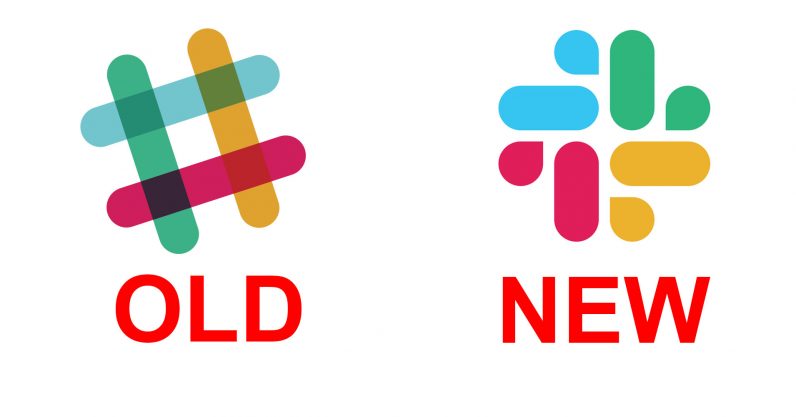
There comes a time in every company’s journey when it needs to find a reason to change its logo. Today, that time has come for Slack. Look, I’m normally cool with logo changes. I think it’s fun to mix things up.
I’m also not a designer. But if you ask me, this new logo is an unequivocal downgrade. But you be the judge. For reference, here’s the old logo again. And here’s the new one: It went from being a unique, quirky, and nerdy logo to something that looks more like it belongs at your local pharmacy. Or maybe a Web…
This story continues at The Next Web
Or just read more coverage about: Slack
. origin »
Bitcoin price in Telegram @btc_price_every_hour
Chronobank (TIME) на Currencies.ru
|
|

