2021-8-7 11:19 |
The new Bitcoin users graph is a sight to behold. Even though Bitcoin’s price was horizontal for a while there, the network kept growing. And, with each new participant, the network expands infinitely. And, with that, the value of the network increases in the same magnitude. Such is the nature of the “network effect” phenomenon.
That is what this chart by on-chain analyst Will Clemente shows:
The number of new users coming on the Bitcoin network continues to reach new all time highs. pic.twitter.com/yttPlhJBPd
— Will Clemente (@WClementeIII) August 4, 2021
As one of the hosts from the Alt-Coin Daily show said, “The traders control the short-term market.” However, if we’re talking long-term, this is one of the most bullish charts you’re going to see. And, luckily for us, Clemente himself explained the chart’s nuances on said YouTube show.
Related Reading | TA: Bitcoin Regains Strength, Why Bulls Eye Strong Rally above $40K
The Whales Are Distributing Their CoinsAccording to Investopedia, the Gini coefficient is:
The Gini index, or Gini coefficient, is a measure of the distribution of income across a population developed by the Italian statistician Corrado Gini in 1912. It is often used as a gauge of economic inequality, measuring income distribution or, less commonly, wealth distribution among a population.
Bitcoin’s Gini coefficient is getting healthier and healthier. According to William Clemente, when you filter out ETFs and Grayscale, on-chain analytics show that “over time whales are just distributing their coins.” According to him, entities with less than 10 BTC never stop buying. “Since May 19th, retail has been accumulating more heavily than the whales have.” Each day that passes, Bitcoin’s “healthy distribution of the network” gets better and better.
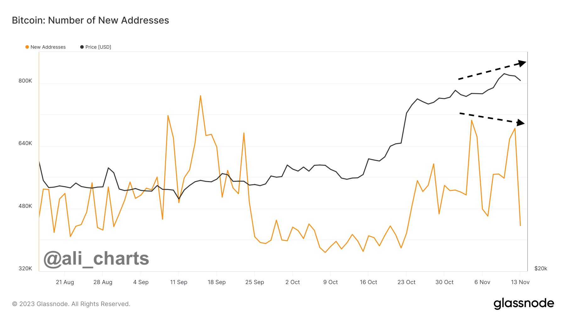
New Bitcoin Users, A Very Appealing-Looking ChartAccording to Clemente, his “very appealing looking chart” shows “the net users growth of the network.” His methodology is simple. He looks for “clusters of addresses that look like one person,” those are the entities. Then, he subtracts “the amount of new entities coming on-chain” from “the entities that look like they’re dormant.” The result is the daily new Bitcoin users.
As the chart clearly shows, we recently achieved an all-time high in new Bitcoin users per day. However, there’s more. According to Clemente, the story is in the “incremental increase between each mayor peak.” At the peak of 2011, 1050 new users came into the network per day. In the two 2013 peaks, the number went from 1500 to about 5000 a day. In 2017’s best moment, Bitcoin was bringing in 40000 new Bitcoin users a day.
Related Reading | Bitcoin Set To Outperform In Second Half Of 2021, Bloomberg Analyst
All of those peaks had a dramatic drop back down. If we look at 2021, in general, it’s a “slow grind higher.” So, “If this is the peak, we haven’t seen this drop-off in new user growth that we had each cycle.” On the contrary, “we just crossed the all-time high of 2017.” If Clemente is right, those new Bitcoin users mean we’re nowhere near the top.
BTC price chart for 08/06/2021 on Bitstamp | Source: BTC/USD on TradingView.com What Do The Greats Say About Bitcoin’s Users?The legend states that once upon a time legendary investor Paul Tudor Jones asked Stan Druckenmiller:
“Do you know that when Bitcoin went from $17,000 to $3000 that 86% of the people that owned it at $17,000, never sold it?” Druckenmiller replied: Well, this was huge in my mind. So here’s something w/ a finite supply & 86% of the owners are religious zealots.
Will the new Bitcoin users act the same way when the season of the bear arrives? Only time will tell.
Featured Images by History in HD on Unsplash - Charts by TradingView origin »Bitcoin price in Telegram @btc_price_every_hour
Time New Bank (TNB) на Currencies.ru
|
|


